Apple MacBook Pro with Touch Bar (13-inch, 2016) Review
Apple MacBook Pro with Touch Bar (13-inch, 2016) Review:
The 2016 MacBook Pro lineup represents Apple’s biggest laptop shake-up in years, taking what was already a a premium brand and pushing it up a notch.
The end result is probably the best laptop you can buy today, but also one of the most expensive. As I established in my review of the cheaper, base model MacBook Pro, the high price meant that its compromises in performance and connectivity proved disappointing. The model on review makes neither – for a price, of course. But here that price is worth it.
MacBook Pro 13-inch (2016, with Touch Bar) – Design and Build
For the first time, the MacBook Pro is available in a choice of colours: classic aluminium or a darker Space Grey; there’s no Rose Gold option yet, but the other two options look superb.
At just 15mm tall, it’s super-thin and happily slid into my already-crowded work bag without issue. The footprint is smaller than previous 13-inch MacBook Pros, but the screen size remains the same. The difference isn’t huge, but it still helps the 13-inch Pro to feel far more portable than any of its predecessors.
There are a few key physical differences to this model compared to the base model, and they all make a significant difference to how you’ll use it.
The first and perhaps most important for professionals is the addition of two extra USB 3.1 Type-C/Thunderbolt 3 combination ports, making a total of four. Two sit on the right edge and two sit on the left, and any of them can be used for charging, which is a nice touch.
Apple doesn’t provide any adapters in the box for regular USB connectors, SD cards or Ethernet cables, so you’ll need to consider an extra spend if you need these. I wish Apple had provided one consolidatory USB-A (“normal USB”) adapter; I can’t think of anyone who wouldn’t appreciate it.
Still, the Thunderbolt ports are supremely useful for professionals, who’ll benefit from lightning-fast data transfers and the ability to hook up to an external monitor with a resolution of up to 5K with only a single cable.
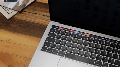
The other external difference is the Touch Bar and TouchID module, which takes the form of a strip of OLED touchscreen that replaces the top row of function keys.
Speaking of which..
MACBOOK PRO 13-INCH – TOUCH BAR
It’s hard to explain the Touch Bar in just words – but simply put, the Touch Bar takes “traditional” function keys but makes them contextually aware.
The OLED touchscreen is split into two distinct sections. The Control Strip features four ever-present shortcuts of your choosing, including access to volume controls, brightness and Siri. The Control Strip can be expanded to cover the entire Touch Bar, providing further shortcuts to options including media playback and keyboard backlight brightness. Essentially, they bring back the functions that were removed along with the physical function keys.
When you’re using an app that supports the Touch Bar, its own app-specific controls will appear. You can change this so the extended Control Strip is always present, and have app-specific controls pop up only when you hold down the Fn key. It’s confusing at first, and will require some training, but once there it will become second nature. You can also bring back regular Fn keys if you wish.
Photos is easily the slickest implementation. While Apple’s photo solution is far from an Adobe Lightroom or even Google Photos killer, I’ve found myself edging back to it since I started using the MacBook Pro. The Touch Bar flips to a scrolling overview of your snaps, letting you flick through them with your finger in a way that will be familiar to anyone who’s used the same app on the iPhone. In fact, you can edit a photo from start to finish using only the Touch Bar: apply a filter, fiddle with the white balance and colour – all without lifting a finger.
It’s well thought out, but there are a few shortcomings. The Touch Bar feels too narrow, and I often ran out of space and had to rearrange my fingers. Ideally I’d like it be double the height, offering more space to play with in creative apps. I also found myself naturally wanting to touch the screen after I touch the Touch Bar. It’s this that makes the concept of a proper touchscreen MacBook more appealing.
The way Photos handles the Touch Bar has me excited for Adobe’s updates to Photoshop that are scheduled to go live before Christmas. If this is done well, then it could be Touch Bar’s killer app.
In essence, the Touch Bar is like having a small slice of Apple’s watchOS running at your fingertips. As such, it’s fast and responsive in the way that only Apple devices seem to be. It’s also been engineered very carefully: unlike a screen, you’re always looking at the Touch Bar at an awkward angle, but it’s been designed to look at its best when viewed from a normal laptop usage position.
There’s at least excellent support for it in Apple’s own apps, and hopefully this will result in good third-party support too. Popular software expected to receive Touch Bar support includes:
- Adobe Photoshop “by the end of the year”
- Microsoft Office
- Skype
- Affinity Designer and Photo
- Da Vinci Resolve
There’s also a dedicated section of the App Store for Touch Bar-capable apps, which is handy.
Some apps don’t utilise the Touch Bar quite so well, and it’s clear that Apple is still trying to see what sticks.
For example, in Safari you get a little overview of all your open tabs, which sounds ace but in practice is pretty useless. Having a tiny top-down view of a website doesn’t work at all: most websites have white backgrounds and look all but identical when laid out side-by-side in that tiny format. It turns into a bit of mess when you have more than 10 tabs open, too. I really hope Apple agrees and gives users the option of using the website’s favicon – the tiny square image that appears next to the website title in most browsers – instead.
Apple has also plucked the word correction and suggestion features from iOS, but the transition isn’t quite as smooth as you’d hope for. When you’re typing in a supported app – this includes TextEdit, Pages, some webforms; but not Google Docs – words pop up on the Touch Bar as you type and you can tap them to alter your spelling or finish the word.
On the whole, it isn’t of much use. The suggestions appear far too slowly to actually speed up the process, and it really only helps if you’re at a loss over how to spell a word and just bash out the closest spelling you can think of. But Apple’s onscreen auto-correction works just as well on the Touch Bar, and you simply press Return to insert a replacement. Typing on the Touch Bar is fairly redundant.
You can at least pick from Emoji, which is fun and actually faster than doing it onscreen.
The decision to keep the ESC key (it’s the only key you can’t remove) seems like a strange one; the cynic in me believing this is simply to avoid some ridiculous internet backlash against its removal. The problem is, it doesn’t actually do much and is often replaced by an X button when you’re working on the Touch Bar, which is confusing.
The Touch Bar might not be the reason to buy the MacBook Pro, but it’s certainly a deal-sweetener.
It’s actually the Touch ID sensor that might be of more appeal. You can use it to both log on and pay for things via Apple Pay, which makes it a super-convenient addition.
MACBOOK PRO 13-INCH (2016, TOUCH BAR) – KEYBOARD AND TOUCHPAD
The keyboard employs the same Butterfly technology usedin the 12-inch MacBook with a few improvements that make it the best laptopkeyboard I’ve used. It's clicky and while its shallow travel might not be for everybody, those who I've subjected to it say they quickly get used to it and find it deeply satisfying to use.
The touch pad is gigantic, and handles every swipe, gesture and tap in the same butter-smooth way you'd expect from a MacOS device. The Force Touch technology employed here means any 'click' you make is simulated by haptic feeback motors, and it feels great. It's pressure-sensitive, too, so you can press harder on certain on-screen items to get a different result. For example, pressing hard on a Safari link opens a preview window, while pushing harder on the QuickTime fast-forward changes speed. It's not utilised everywhere, but it's still a great feature
Apple MacBook Pro with Touch Bar (13-inch, 2016) Review
 Reviewed by youssef
on
11:11
Rating:
 Reviewed by youssef
on
11:11
Rating:


No comments: